Reading and interpreting forex charts is essential for technical trading, but chart analysis alone does not guarantee profitable outcomes. Pattern misidentification can lead to losing trades even when you correctly identify market structure. Leverage amplifies both profits and losses on every position. Price gaps during low-liquidity sessions can exceed your planned stop losses. Past performance is not indicative of future results. Capital at risk.
Forex chart reading is the systematic interpretation of price movement across a horizontal time axis and a vertical price axis. By analyzing the relationship between opening, closing, high, and low prices, traders can identify market trends and institutional momentum. In 2026, proficiency in visual analysis is the primary differentiator between speculative gambling and disciplined, data-driven trading.
How to read forex charts involves decoding the spatial relationship between price value and time duration. This skill enables market participants to identify periods of high volatility and structural stability across major currency pairs. It serves as the foundational language for every technical trading strategy.
The modern 2026 trading environment requires a seamless integration of desktop and mobile charting capabilities. Successful traders utilize these visual tools to filter macroeconomic news and focus on the underlying supply and demand dynamics of the global economy. Nearly all retail order entry now happens through a charting interface rather than a phone or a dealing desk.
While understanding Forex is important, applying that knowledge is where the real growth happens. Create Your Free Forex Trading Account to practice with a free demo account and put your strategy to the test.
What are forex charts and why are they used?
A forex chart is a graphical record of a currency pair’s historical exchange rate that enables traders to identify patterns and trends. These visual tools transform raw price data into actionable patterns that reveal market psychology and institutional positioning. Understanding chart structure unlocks the ability to predict future price movements with higher accuracy.
Charts display two critical axes:
- The Y-axis (Vertical) measures exchange rate price, typically displayed to the fourth or fifth decimal point.
- The X-axis (Horizontal) measures time progression, from 1-minute intervals to weekly bars.
This combination reveals when the market reaches extreme prices and how long consolidation periods last. Candlestick charts are the default view on essentially every retail platform, which is why most published analysis assumes them. Charts enable What is a Pip measurement and price distance calculations across any market structure.
The Vertical Scale: Understanding Price and Bid-Ask
The vertical axis of a forex chart measures the exchange rate price, typically displayed to the fourth or fifth decimal point. This precision reveals the micro-structure of market movement and allows traders to identify rejection wicks and small-body consolidations. The bid represents the price at which the market will buy from you; the ask represents the price at which you can buy from the market.
Bid-ask spread visualization on modern charts shows the gap between these two prices. During high-liquidity sessions, spreads narrow, often 1-2 pips on EUR/USD. During low-liquidity Asian sessions, spreads widen to 5-10 pips. Understanding this relationship ensures you measure realistic profit targets and stop-loss distances.
Ready to Elevate Your Trading?
You have the information. Now, get the platform. Join thousands of successful traders who use Volity for its powerful tools, fast execution, and dedicated support.
Create Your Account in Under 3 MinutesWhat are the 3 main types of forex charts?
The three primary types of forex charts identify different levels of price detail, ranging from basic closing lines to comprehensive OHLC data. Each chart type serves specific analysis needs, from long-term trend identification to intraday entry timing. A candlestick carries four prices where a line chart carries one, so the same screen width shows a great deal more about how each period actually traded. Wikipedia’s candlestick chart and open-high-low-close chart articles set out both constructions.
Line charts display only closing prices connected by a continuous line. This simplicity reveals the overall trend direction without intra-period noise. Professional traders use line charts on weekly timeframes to identify the “big picture” trend before drilling down to shorter timeframes.
Bar charts (OHLC) show open, high, low, and close as four points within a vertical bar. This format provides volume context without the colored bodies of candlesticks. Many institutional traders prefer bar charts for their neutral appearance and clean visual structure.
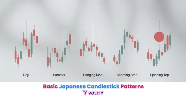
Candlestick charts are the industry standard for technical analysis. Each candle displays four data points plus a visual representation of buyer-seller momentum. The real body color indicates directional bias (green = bullish, red = bearish), while wicks reveal price rejection at extremes. How to Read Candlesticks provides detailed guidance on candle anatomy and pattern interpretation.
How do you read a forex chart for beginners?
Systematic chart reading identifies the current market phase by analyzing the sequence of price peaks and troughs. This approach reveals whether the market is trending upward, trending downward, or consolidating in equilibrium. Beginners who master this foundation avoid the trap of trading against the dominant trend.
Identifying trends requires recognizing the hierarchy of price extremes. A market trend is read off that sequence: an uptrend shows Higher Highs and Higher Lows, each successive peak is above the prior peak, and each trough is above the previous trough. A downtrend reveals Lower Highs and Lower Lows, each successive peak is below the prior peak, and each trough is below the previous trough. A ranging market bounces between two prices with no directional progress.
Wikipedia’s support and resistance article defines the concept; in practice these are areas where price historically reversed or stalled. Support represents the price floor where buyers typically defend; resistance represents the ceiling where sellers typically defend. Support and Resistance Trading explains how to identify these structural levels across multiple timeframes.
Timeframe selection determines the depth of data visible. A 1-minute chart shows scalp opportunities within larger trends. A 4-hour chart reveals swing trade patterns and intraday directional shifts. A daily chart exposes multi-week trends and major structural support/resistance. Matching timeframe to your trading style ensures alignment between chart patterns and your holding duration.
Worked illustration: a “Double Bottom” forms on the 1-hour chart at a level that has held before, with RSI oversold. The setup is only confirmed once price closes above the neckline; the target is measured from the pattern, and the stop sits below the second low. Those are the mechanics, not a record of a particular trade. Past performance is not indicative of future results.
How do you read a forex chart on MT4 and MT5?
Trading platform interfaces identify the specific technical tools and settings required to customize your forex chart layout. MetaTrader 4 and MetaTrader 5 remain the industry standard for retail traders in 2026. Understanding platform capabilities enables faster analysis and more precise entry execution.
| Platform Tool | Function | Best Use Case |
| Crosshair | Price/Time Pinpoint | Precise Measurement |
| Trendline | Diagonal Support | Trend Identification |
| Fibonacci | Retracement Levels | Reversal Timing |
| Indicators | Mathematical Overlay | Momentum/Trend Filter |
| Timeframe Switch | Interval Change | Multi-TF Analysis |
Tool names and functions follow the MetaTrader 5 chart documentation.
MT4 customization involves right-clicking on the chart to adjust colors, remove gridlines, and add technical indicators. The toolbar contains the timeframe selector (M1, M5, M15, H1, D1, W1). TradingView’s features page and the MetaTrader 5 user interface documentation cover what each platform exposes and where.
MT5 offers superior charting tools compared to MT4, including a native multi-timeframe indicator capability. The platform’s advanced drawings and template-saving features improve workflow efficiency for traders managing multiple pairs simultaneously.
Common chart reading mistakes to avoid
Analysis paralysis represents the most common beginner error, caused by overcrowding charts with too many conflicting indicators. When five indicators point in different directions, traders freeze and miss the entry entirely. Professional traders often ignore “lower wick” signals in strong uptrends, treating them as simple profit-taking rather than reversals.
“Indicator Soup” overwhelms the decision-making process with redundant signals. Most traders benefit from limiting analysis to 2-3 core tools: price structure, volume, and one momentum filter. Adding RSI, MACD, moving averages, stochastics, and Bollinger Bands simultaneously creates paralysis instead of clarity.
Ignoring the higher timeframe represents the second major error. A 5-minute uptrend inside a daily downtrend is trading against the structure that is actually setting the range. Top-down analysis prevents these counter-trend trades from occurring. Technical Indicators for Trading explains how to use secondary tools without overwhelming your analysis.
Revenge trading after a “fakeout” break destroys accounts faster than any single losing trade. When a visible chart pattern fails, emotional traders immediately re-enter the same setup hoping for a second chance. This behavior locks in losses and increases risk exposure beyond the planned amount.
Turn Knowledge into Profit
You have done the reading, now it is time to act. The best way to learn is by doing. Open a free, no-risk demo account and practice your strategy with virtual funds today.
Open a Free Demo AccountThe Future of Charting: AI and Multi-Dimensional Analysis
The 2026 charting revolution represents a shift toward immersive, multi-dimensional price data visualization. Institutional trading desks now use AI-powered pattern recognition that identifies chart formations faster than human eyes. These tools augment rather than replace human decision-making for retail traders.
VR/AR charting enables viewing currency correlations in 3D space. Traders can visualize how three pairs move together and spot lead-lag relationships that flat 2D charts obscure. Real-time sentiment overlays show retail vs. institutional positioning directly on candlesticks. This transparency reveals where large orders are queuing and when liquidity traps are forming.
Forex Trading for Beginners provides foundational knowledge for understanding currency pair mechanics.
Key Takeaways
- Forex charts are essential visual tools that plot currency price fluctuations against a timeline.
- Candlestick charts are the preferred method for modern traders because they reveal both price and market psychology.
- Support and resistance levels identify psychological price barriers where the market is likely to reverse or consolidate.
- Timeframe selection determines the depth of data visible, ranging from 1-minute scalping to weekly position analysis.
- Market trends are identified through the sequence of higher highs or lower lows in price action.
- Technical indicators should be used sparingly as secondary confirmation for structural patterns found on the chart.
Frequently Asked Questions
This article contains references to forex charts, technical analysis, and Volity, a regulated CFD trading platform. This content is produced for educational purposes only and does not constitute financial advice or a recommendation to buy or sell any financial instrument. Chart-based trading carries substantial risk of loss, particularly in volatile or illiquid market sessions. Always verify platform functionality and spreads before committing real capital. Some links in this article may be affiliate links.