Investing in financial products involves risk. Losses may exceed the value of your original investment.
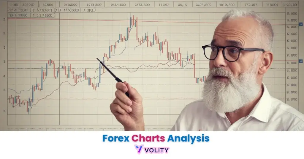
Mastering forex chart reading is essential for effective technical analysis and successful price action trading. This guide shows you how to interpret charts systematically, turning market data into actionable insights. True chart analysis goes beyond lines and bars, it means understanding market structure, spotting trends, and making confident trading decisions.
What Are Forex Charts?
A forex chart is a visual graph showing a currency pair’s price movement over time, with price on the Y-axis and time on the X-axis. It displays OHLC data, Open, High, Low, Close, for each period, helping traders identify trends, entry and exit points, and market volatility.
Key Elements of Reading Forex Charts
The key elements of reading forex charts include understanding chart types, timeframes, price scales, and technical indicators. Each element reveals a different aspect of market behavior, from long-term trends to short-term price action, helping traders make informed and strategic trading decisions.
Timeframes
A forex timeframe defines the period over which each candle or bar on a chart is formed. The choice of timeframe is directly linked to a trader’s strategy.
For a deeper dive, see our complete guide on the Best Timeframes for Forex Trading.
- Scalping: Uses very short timeframes like the 1-minute (M1) to 5-minute (M5) charts for rapid trades.
- Day Trading: Operates on 15-minute (M15) to 1-hour (H1) charts to open and close positions within the same day.
- Swing Trading: Focuses on 4-hour (H4) to Daily (D1) charts to capture market “swings” over several days or weeks.
- Position Trading: Employs Daily (D1) to Weekly (W1) charts to analyze long-term trends and hold positions for extended periods.
Price Points (OHLC)
The OHLC values represent the four most important pieces of data for any trading period:
- Opening price: The price at the beginning of the timeframe.
- High: The highest price reached during the timeframe.
- Low: The lowest price reached during the timeframe.
- Closing price: The price at the end of the timeframe.
For example, a daily chart for the EUR/USD pair will show a single candle representing the OHLC for that 24-hour trading session.
Support and Resistance Levels
Support and resistance in forex are key price levels where the momentum of a trend is likely to pause or reverse. These levels are critical for identifying potential trade entries and exits.
- Support: A price floor where buying interest is strong enough to overcome selling pressure. It can be identified as a horizontal level or a rising trendline.
- Resistance: A price ceiling where selling interest is strong enough to overcome buying pressure. It can be a horizontal level or a falling trendline.
- Supply and Demand Zones: Broader areas on a chart where a significant imbalance between buyers and sellers has historically occurred.
Technical Indicators
Technical indicators are algorithmic tools applied to a chart to clarify price action and provide trade signals. They are broadly categorized by their function: trend, momentum, or volatility.
- Moving Averages (MA): A trend-following indicator used to smooth price data. Crossovers between different MA periods (e.g., 50-day and 200-day) are used as trend confirmation signals.
- Relative Strength Index (RSI): A momentum indicator that measures the speed and change of price movements to identify overbought (>70) or oversold (<30) conditions. According to Investopedia, the RSI is one of the most popular oscillators used by traders.
- Bollinger Bands: A volatility indicator consisting of a middle band (an MA) and two outer bands that represent standard deviations. Widening bands indicate increased volatility.
Chart Patterns
Forex chart patterns are recognizable formations that suggest a potential continuation or reversal of a trend. Successful forex pattern trading requires identifying these price action setups and waiting for confirmation.
| Pattern Name | Type | Reliability Score (out of 10) |
| Head and Shoulders | Reversal | 8 |
| Double Top/Bottom | Reversal | 7 |
| Ascending/Descending Triangle | Continuation | 7 |
| Bullish/Bearish Flag | Continuation | 8 |
Types of Forex Charts
Traders use several forex chart types to analyze the market. The best choice depends on the required level of detail and the trader’s analytical style. For a full comparison, review our guide to the Best Forex Chart Types.
| Chart Type | Best For | Data Displayed | Pros | Cons |
| Line Chart | Beginners, trend spotting | Closing price | Simple, clean, easy to read | Lacks OHLC detail |
| Bar Chart | Detailed analysis | OHLC | Provides complete price data | Can look cluttered |
| Candlestick Chart | All traders, pattern analysis | OHLC | Highly visual, shows market sentiment | Can be complex for absolute beginners |
| Heikin-Ashi | Trend traders | Averaged OHLC | Smooths price, reduces noise | Lags behind actual price |
| Renko Chart | Breakout & trend traders | Price movement only | Filters out time and noise | Brick size setting is subjective |
How to Read Forex Charts Effectively
Effective forex price action analysis is a multi-step process that combines different chart elements into a cohesive strategy.
- Identify the Primary Trend: Use a higher timeframe (e.g., daily) to establish the overall market direction. Use trendlines or a Moving Average to confirm if the market is in an uptrend, downtrend, or consolidation.
- Analyze Price Action and Patterns: Zoom into a lower timeframe (e.g., 4-hour) to find price action setups. Look for candlestick patterns or established forex chart patterns forming near key support or resistance levels.
- Use Indicators for Confirmation: Apply indicators like RSI or MACD to confirm the signal. For a breakout trade, pattern validation should be supported by a surge in trading volume, indicating strong market conviction.
- Practice Multi-Timeframe Analysis: A robust multi-timeframe forex strategy involves using a long-term chart for direction, a medium-term chart for setup, and a short-term chart for precise entry.
Why Are Forex Charts Important for Traders?
Forex charts are important because they are the foundation of technical analysis, allowing for objective, data-driven decision-making. They visualize market sentiment and provide the framework for strategy validation. Without charts, traders cannot accurately time entries and exits or manage risk effectively.
Beginner’s Tips for Reading Forex Charts
Beginners should focus on building a solid foundation.
- Practice on Demo Accounts: Spend at least 100 hours practicing on a demo account before risking real capital.
- Limit Your Indicators: Start with a maximum of 2-3 indicators (e.g., one for trend, one for momentum) to avoid “analysis paralysis.”
- Master Risk Management: Implement the 2% rule from day one. Good risk management is more important than any single strategy.
Forex Trading Rules You Should Know
Disciplined trading is built on proven rules. For a complete overview, explore our Forex Risk Management guide.
- 2% Rule: Never risk more than 2% of your trading capital on any single trade.
- 5-3-1 Rule: A framework for focus: trade 5 major currency pairs, master 3 core strategies, and trade during 1 primary market session.
- 80/20 Rule: Acknowledge that approximately 80% of profits come from 20% of trades. This encourages patience and selectivity.
- Break-even Rule: Move your stop-loss to your entry price once a trade moves a significant amount in your favor to create a risk-free trade.
Common Beginner Mistakes
Avoiding common forex trading mistakes and chart reading errors can significantly accelerate a trader’s learning curve.
- Overtrading: Taking too many low-quality trades due to impatience or a desire for action.
- Ignoring Higher Timeframes: Entering trades based on a 5-minute chart without checking the trend on the 4-hour or daily chart.
- Misidentifying Patterns: Acting on a chart pattern before it has fully formed and been confirmed by a breakout.
Bottom Line
The ability to read forex charts is a core skill for technical traders. Mastering OHLC data, chart patterns, and analysis techniques builds a strong foundation. Progress comes through practice, disciplined rule application, and continuous learning, supported by advanced strategies and risk management knowledge.
FAQs
What our analysts watch: Most retail charts are read inside-out (zoom in, find a pattern, take the trade). The institutional habit is the inverse.
Start on the weekly to read regime. Drop to the daily to map structure (higher highs, lower lows, key swing levels).
Drop to H4 for trigger setups, and only then to H1 or M15 for entry timing. Every level we mark on the lower timeframe has to defer to a level on the higher one.
When the H1 setup contradicts the daily structure, the H1 setup is wrong, not the chart. This single habit produces the largest variance reduction in entry quality of anything we teach new analysts.
Frequently asked questions
Which forex chart type should beginners use first?
Candlestick on the H4 and daily timeframes. Line charts hide intra-bar information; bar charts are visually noisier than candles for the same data. The Investopedia introduction to candlestick charts covers the canonical patterns and the contexts where they actually matter.
How do I identify the trend on a forex chart?
Higher highs and higher lows is an uptrend. Lower highs and lower lows is a downtrend.
Anything else is a range. Confirm with a 50-period exponential moving average on the same timeframe and require price to be on the trend-consistent side of it.
The CME technical-analysis introduction is a clean reference for trend definitions.
What are the most reliable forex chart patterns?
Head and shoulders, double tops/bottoms, and trend-line breaks score highest in the published academic literature on retail technical analysis, but only when confirmed by volume or higher-timeframe structure. Any pattern read in isolation has a high false-positive rate.
Which indicators are essential for reading forex charts?
One trend filter (50 EMA), one momentum oscillator (RSI or stochastic), one volatility tool (ATR for stop placement). More than three indicators on the same chart actively reduces decision quality. The BIS working paper on technical analysis reviews the empirical performance of common indicators.
Related guides
- Forex trading for beginners
- Best forex trading strategies
- Risk management in forex trading
- Forex scalping strategy
- Best forex trading platforms 2026
Quick takeaways
Here is what matters most for this guide.
- Forex moves nearly $9.6 trillion daily across major, minor, and exotic currency pairs.
- Session timing, leverage, and order types determine whether a setup turns into edge.
- Moreover, central-bank policy and macro data drive the largest intraday moves.
Therefore, read on for the full breakdown below.
Volity operates a trading platform and also publishes educational and analytical content about trading. The content on this page is for educational purposes only and should not be considered financial advice. Volity may benefit commercially when readers open trading accounts through links on this site.
Our content is produced and reviewed under documented editorial standards; comparison and review methodology is published here.


