Trend lines are fundamental graphical tools in technical analysis and data visualization, crucial for identifying the direction of market trends and data patterns. By connecting significant data points, they provide visual support and resistance levels, aiding in the prediction of future price movements. This guide will teach you how to draw, validate, and interpret trend lines, enabling you to make more informed trading and analytical decisions.
While understanding Trend Line is important, applying that knowledge is where the real growth happens. Create Your Free Forex Trading Account to practice with a free demo account and put your strategy to the test.
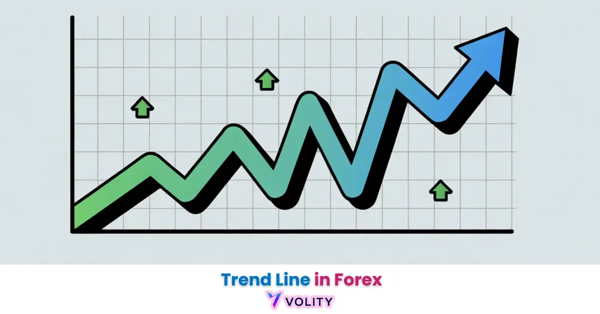
What is a trend line?
A trend line is a powerful visual tool that helps identify the direction of a prevailing market trend. It connects specific data points on a chart to illustrate the general path that prices or data values are taking over a period.
This simple yet effective concept is a cornerstone of technical analysis, used widely to simplify complex information. Trend lines are among the most frequently used tools in technical analysis, with many professional traders incorporating them into their strategies.
Why Analysts Use Trend Lines?
Analysts use trend lines for several key purposes, primarily to identify and confirm the market trend. When a trend line connects higher lows, it indicates an Uptrend, signaling bullish sentiment. Conversely, a line connecting lower highs points to a Downtrend, reflecting bearish pressure.
These lines also serve as dynamic support and resistance levels, where prices may bounce or reverse. Furthermore, trend lines aid in forecasting potential future price paths and identifying crucial areas where a trend might accelerate or reverse, thereby informing various trading strategy decisions.
How to Draw & Validate Effective Trend Lines
Drawing effective trend lines is a skill that requires precision and adherence to specific guidelines to ensure their reliability. Many beginners find their trend lines breaking easily, often due to improper drawing techniques. Proper validation of a trend line helps differentiate between a strong, reliable indicator and a weak, easily breached one.
This section explains the practical steps and considerations for creating robust trend lines.
How to draw a valid trend line?
To draw a valid trend line, analysts connect significant data points on a chart. For an Uptrend, the line is drawn connecting two or more consecutive higher lows, extending upwards to the right. For a Downtrend, the line connects two or more consecutive lower highs, extending downwards to the right.
A valid trend line requires at least two significant price points for a straight line and three for better confirmation of its strength.
Do not force a trend line; if the points do not align naturally, a valid trend may not be present, indicating the absence of a clear directional bias.
What makes a trend line reliable?
The reliability of a trend line depends on several factors. A stronger trend line is confirmed by more data points touching or coming close to the line, indicating broader market agreement. The slope or angle of the line also matters; overly steep lines are often unsustainable, while flatter lines might indicate weaker momentum.
Furthermore, the chosen Timeframe significantly impacts a trend line’s validity. Trend lines drawn on daily or weekly charts are generally considered more significant than those on hourly or minute charts because they represent longer-term market sentiment.
Trend lines work in charts by providing a visual boundary that prices tend to respect, acting as a dynamic support and resistance level.
Common Mistakes When Drawing Trend Lines
Common mistakes when drawing trend lines include forcing a line to fit the data, ignoring price wicks (the highest and lowest points of a candle), or failing to adjust lines as market conditions change.
Many users find their trend lines keep getting broken easily, often because they are drawn too subjectively or without enough confirming data points. To avoid these errors, always connect at least two clear swing highs or swing lows. Prioritize horizontal support and resistance levels over forced diagonal lines.
Regularly reassess and redraw trend lines as new price action unfolds, ensuring they remain relevant to the current market structure.
Ready to Elevate Your Trading?
You have the information. Now, get the platform. Join thousands of successful traders who use Volity for its powerful tools, fast execution, and dedicated support.
Create Your Account in Under 3 MinutesHow to Trade Trend Lines
Technical analysis relies heavily on tools like trend lines to interpret market behavior and formulate trading strategies. These lines serve as dynamic indicators, helping traders identify potential entry and exit points, as well as crucial areas of support and resistance.
Despite the rapid pace of modern markets, trend lines remain a cornerstone of technical analysis for identifying underlying market trends, proving their enduring value. This section explores how trend lines are integrated into comprehensive trading approaches.
How do trend lines differ from moving averages?
Trend lines and moving averages are both used in technical analysis to identify market direction, but they differ significantly in their calculation and application. While both are essential for understanding market trend, their distinct characteristics make them suitable for different analytical approaches.
| Feature | Trend Lines | Moving Averages |
| Calculation | Manually drawn, connects specific data points | Automated, averages prices over a period |
| Flexibility | Subjective, requires interpretation | Objective, formula-based |
| Application | Identifies dynamic S/R, trend boundaries | Smoothes price, identifies trend direction |
| Key Use | Breakouts, reversals, chart patterns | Crossovers, general trend confirmation |
Trend lines are more flexible and subjective, allowing for nuanced interpretation of price action, while moving averages provide an objective, lagging indication of average price over time. This makes them complementary rather than interchangeable tools in a trading strategy.
How to interpret a trend line break?
A trend line break is a significant event that can signal a potential shift in market dynamics. When price moves decisively beyond an established trend line, it indicates a Breakout. This can suggest either a trend reversal or a temporary pause before the original trend resumes.
Often, after a breakout, the price will perform a Retest, returning to the broken trend line before continuing in the new direction. Confirming a breakout often involves observing increased Volume and looking for subsequent price action that supports the new trend direction.
Emotional decisions during trend line breaks can lead to significant beginner trading losses, underscoring the impact of psychological bias.
How to use trend lines in a trading strategy?
Trend lines are a versatile component of any comprehensive trading strategy. They help define clear entry and exit points; a Breakout above a descending trend line might signal a buy entry, while a break below an ascending one could indicate a sell.
Trend lines also assist in placing stop-loss orders, typically just beyond the trend line to limit potential losses if the trend unexpectedly reverses. By acting as dynamic Support and Resistance levels, they provide clear boundaries for price action. Combining trend lines with other Indicators, such as MACD or RSI, can provide stronger confirmation signals.
Effective Risk Management is paramount when using trend lines, as no single indicator guarantees success. Trend lines are especially useful during clear, directional markets.
Trend Lines in Data Visualization & Analysis
While often associated with financial markets, trend lines are a universal tool for data visualization and analysis across numerous fields. They help extract meaningful patterns from complex datasets, enabling clearer communication of insights.
This section explores the broader applications of trend lines and delves into more sophisticated types beyond simple linear relationships, foundational for interpreting diverse data points.
The Universal Language of Trend Lines in Data Visualization
Trend lines distill complex data points into understandable patterns in economics, science, and business. In economics, they might illustrate GDP growth over time; in science, they could show experimental results; and in business, they can track sales performance or customer engagement.
These visual aids make it easier to identify long-term trends, forecast future values, and make data-driven decisions. They provide a clear visual summary, improving the interpretability of charts and graphs, which is a core goal of effective data visualization.
Trend lines help analysts quickly grasp the underlying direction or relationship within a scatter plot or time series.
Beyond Linear Regression
Linear regression is the most common mathematical method for calculating trend lines in various forms of data analysis, providing a statistical ‘line of best fit’. This method creates a straight line that best describes the relationship between variables. However, not all data follows a linear path.
For more complex data points and patterns, advanced trend line types are essential. A Polynomial Trendline, for instance, is used for data with curved patterns, adapting to multiple fluctuations, while a Logarithmic Trendline is ideal for data that initially changes rapidly but then levels out, often seen in growth or decay processes.
Common User Challenges, Psychological Biases & Advanced Insights
Understanding the technical mechanics of trend lines is only one part of the equation; overcoming human challenges and psychological biases is equally crucial for effective application. This section delves into the often-overlooked human element and introduces advanced tools that can further refine trend line analysis.
It offers insights most traditional guides miss, providing a more comprehensive perspective.
Overcoming Emotional Biases
Emotional decisions during trend line breaks can lead to significant beginner trading losses, underscoring the impact of psychological bias.
Traders often fall prey to confirmation bias, seeing only the trend lines that confirm their existing beliefs, or anchoring bias, fixating on initial trend lines even when market conditions shift. This can lead to misinterpreting or misdrawing trend lines, causing them to break easily.
To mitigate psychological bias, traders should maintain objectivity, rely on multiple confirmations, and adhere to a predefined trading strategy. Recognizing these emotional pitfalls is vital for consistent success in market analysis, promoting a disciplined approach to price action.
Beyond the Basics
Beyond manually drawn lines and standard Linear Regression, advanced tools offer more sophisticated ways to analyze trends. The Dual Structural Trendline Fib Channel, for example, is a complex indicator that combines trend lines with Fibonacci retracement levels to identify dynamic price channels and potential reversal zones.
Such tools are often found in advanced trading platforms like TradingView. While specific software is best for drawing trend lines often depends on individual needs, platforms offering advanced charting capabilities and custom Indicators are generally preferred.
These tools can also play a role in Algorithmic Trading, where automated systems use predefined trend line parameters to execute trades, removing human emotion from the decision-making process.
Turn Knowledge into Profit
You've done the reading, now it's time to act. The best way to learn is by doing. Open a free, no-risk demo account and practice your strategy with virtual funds today.
Open a Free Demo AccountHow to Master Trend Lines for Informed Decisions
Trend lines are indispensable tools for both technical analysis and broader data visualization. From identifying fundamental market trends and dynamic support and resistance levels to forecasting future data patterns, their utility spans diverse applications.
This guide has presented a holistic approach, moving beyond basic drawing techniques to explore advanced statistical methods like Polynomial Trendlines and Logarithmic Trendlines, while also addressing critical psychological biases that can impact interpretation.
By understanding the nuances of drawing, validating, and interpreting trend lines, analysts and traders can significantly improve their decision-making processes, leading to more informed and effective outcomes. Mastering these visual instruments is a continuous journey that yields profound insights into market behavior and data patterns.
Key Takeaways
- Trend lines are fundamental for identifying market trends (Uptrends, Downtrends) in technical analysis.
- Drawing requires connecting at least two significant data points for validity, with three for stronger confirmation.
- They act as dynamic support and resistance levels, guiding trading strategy for entries, exits, and risk management.
- Beyond finance, trend lines are critical for data visualization, with Linear Regression, Polynomial Trendlines, and Logarithmic Trendlines fitting diverse data patterns.
- Overcoming psychological bias is crucial for accurate interpretation and avoiding common trading losses.