Stock chart reading and technical analysis involve significant risks of capital loss due to false signals, indicator lag, and the unpredictable nature of market psychology. Chart patterns and technical indicators are not guarantees of future price movements; many patterns fail to deliver expected outcomes due to changing market regimes and unexpected news events. Overreliance on technical analysis without fundamental analysis or risk management can lead to catastrophic losses, particularly in leveraged trading. Past performance is not indicative of future results. Capital at risk.
Reading stock charts identifies the historical price action and volume of a security, allowing traders to predict future market movements through technical patterns. Modern charting adds volatility-band trend filters such as the Evasive SuperTrend, an ATR-based variant of the classic SuperTrend, alongside Volume Profile analysis. By mastering these visual tools alongside traditional candlestick patterns, you can identify high-probability entry points and manage risk with institutional-grade precision.
While understanding Stock Chart Analysis is important, applying that knowledge is where the real growth happens. Create Your Free Forex Trading Account to practice with a free demo account and put your strategy to the test.
Stock charts function as a transparent map of investor psychology and market supply-and-demand dynamics. This methodology identifies recurring price formations that signal potential breakouts, reversals, or trend continuations. It serves as a primary data source for both short-term swing traders and long-term investors seeking to optimize their entry prices in 2026.
The 2026 trading environment emphasizes the integration of algorithmic insights with traditional chart reading. Investors utilize high-resolution charting platforms to filter market noise and to recognize institutional accumulation patterns before they become obvious to the broader public. Understanding how to decode these patterns represents a competitive advantage in an increasingly transparent market.
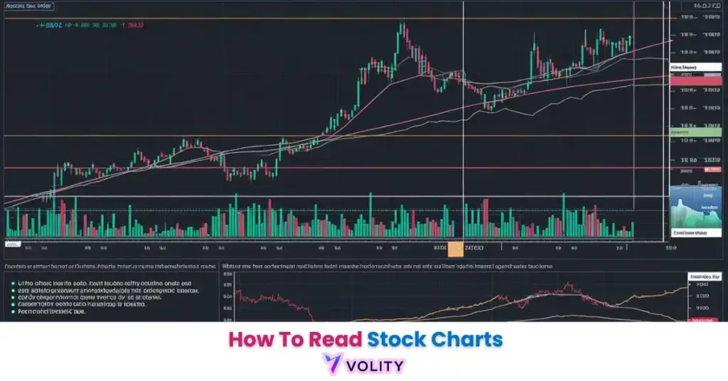
The Anatomy of a Stock Chart: Price and Volume
A stock chart is a graphical representation of price action over time, identifying the historical balance between buyers and sellers. This visual display reveals patterns invisible in raw data, allowing traders to spot opportunities before they trigger broad market recognition.
Three core components define every stock chart. The price axis (Y) displays the stock’s value using either linear scaling (equal distance for $1 moves) or logarithmic scaling (equal distance for percentage moves). The time axis (X) arranges data chronologically from left to right, allowing traders to track how sentiment evolves. Volume histograms appear below, displaying the number of shares traded at each price, the “fuel” that confirms or denies the authenticity of price moves. Volume is what separates a breakout that holds from one that fades, which is why volume confirmation is treated as a requirement rather than an optional extra.
Line vs. Candlestick Charts
Candlestick charts represent the institutional standard for 2026 analysis because they provide significantly more data on intraday sentiment than simple line charts. A single candlestick displays four critical price points, open, high, low, and close, revealing the intraday battle between bulls and bears in a single visual element.
Line charts connect closing prices with a simple line, providing a clean but data-poor overview suitable for macro analysis or casual monitoring. Candlestick charts display the full OHLC (Open, High, Low, Close) data through the “body” (the rectangle between open and close) and “wicks” (the thin lines extending to the intraday high and low). This granularity reveals whether buyers or sellers maintained control throughout the session, a critical distinction for technical analysis precision.
Ready to Elevate Your Trading?
You have the information. Now, get the platform. Join thousands of successful traders who use Volity for its powerful tools, fast execution, and dedicated support.
Create Your Account in Under 3 MinutesDecoding Candlestick Patterns and Investor Sentiment
Candlestick patterns identify the immediate psychological state of the market, revealing whether bulls or bears are currently in control. These formations repeat across different timeframes and securities, creating a universal visual language for market participants.
Three pattern categories dominate chart analysis. Bullish patterns, such as the Hammer, Bullish Engulfing, and Morning Star, signal potential reversals from downtrends or continuation of uptrends with increasing buyer dominance. Bearish patterns like the Shooting Star, Bearish Engulfing, and Evening Star identify seller control and potential downside acceleration. Indecision patterns, Dojis and Spinning Tops, reveal equilibrium between buyers and sellers, often signaling a breakout in either direction is imminent.
Recognize trading chart patterns is easier than it used to be, because pattern-scanning software now flags formations automatically across hundreds of instruments. That means traders without decades of screen time can put the same shortlist in front of themselves that a desk analyst would, though the judgement about which setups to act on still has to be theirs.
Core Technical Indicators for the 2026 Market
Technical indicators identify momentum, trend strength, and overbought/oversold conditions through mathematical overlays on the price chart. These tools transform raw price action into quantifiable signals, removing emotion from the decision-making process.
Four indicator types form the foundation of 2026 technical analysis. Moving averages, particularly the 50-day and 200-day, identify structural trends by smoothing out daily noise; the 200-day line serves as the critical bull/bear divider for institutional traders. The Relative Strength Index (RSI) measures the speed and magnitude of price changes, identifying “exhaustion” when RSI exceeds 70 (overbought) or drops below 30 (oversold). The SuperTrend family of indicators plots an ATR-based band around price and flips direction when price closes through it; the Evasive variant widens the band inside a defined noise zone so that ordinary chop does not trigger a false flip. Volume Profile Composite analysis identifies “Fair Value” zones where price naturally stabilizes after finding equilibrium between buyers and sellers.
How the confluence works in practice:
Take a large-cap such as Apple (AAPL) pulling back into its 200-day simple moving average while the SuperTrend band flips to the upside and volume profile shows a heavily traded shelf at the same price. Three independent tools pointing at one level is the confluence that turns a guess into a plan, and it is the setup behind most attempts to buy the dip. It is an illustration of the rule, not a record of a trade, and confluence raises the odds rather than removing the risk. Past performance is not indicative of future results.
Moving average analysis remains the simplest and most effective indicator for beginning traders, as it directly measures the average opinion of value over your chosen timeframe. This accessibility explains its continued dominance even in 2026’s age of AI-enhanced trading.
Recognizing Reliable Chart Patterns: Breakouts and Reversals
Chart patterns identify the geometric shapes formed by price action that historically precede significant market moves. These formations arise from the collective psychology of millions of traders, making them remarkably consistent across decades of market history.
| Pattern Name | Break-even failure rate (tested) | Trend Type | Key Signal |
| Cup with handle | 5% (rank 3 of 39) | Continuation | Breakout above the rim |
| Head-and-shoulders top | 19% (rank 9 of 36) | Reversal | Neckline breach |
| Double bottom (Eve and Eve) | 12% (rank 5 of 39) | Reversal | Break above the middle peak |
| Ascending triangle | 17% up, 38% down (rank 16 of 39) | Continuation | Higher lows, flat top |
| Flag | 44% up, 45% down (not ranked) | Continuation | Brief pause, then continuation |
Figures are Thomas Bulkowski’s tested results, from his chart pattern statistics. The break-even failure rate is the share of patterns that fail to move even 5% in the breakout direction. It is not a win rate on a live account.
The cup with handle is the strongest performer in that set: Bulkowski ranks it 3rd of 39 chart patterns, with only 5% failing to clear the 5% break-even move and an average rise of 54% to the ultimate high. The head-and-shoulders top identifies the peak of bull moves through its distinctive three-peak formation and triggers selling when the neckline breaks; it fails to reach break-even 19% of the time and pulls back to the neckline in 68% of cases.
Support and Resistance: The “Lines in the Sand”
Support and resistance levels identify the specific price points where supply and demand historically reach an equilibrium, triggering reversals. These “lines in the sand” represent the collective memory of where institutional money has entered and exited positions.
Support marks the price floor where bargain hunters step in aggressively, refusing to let the stock fall further. Resistance identifies the ceiling where profit takers dominate, preventing rallies from continuing. On an index chart the levels that matter are the ones the market has already traded heavily, because that is where positions were opened and where holders decide whether to defend or exit. Draw them from the chart in front of you rather than from a number someone quoted last quarter.
Stop-Loss Order placement directly below support levels represents the most common risk management technique for technical traders, as support breaks often trigger rapid acceleration of selling before equilibrium reestablishes.
Turn Knowledge into Profit
You have done the reading, now it is time to act. The best way to learn is by doing. Open a free, no-risk demo account and practice your strategy with virtual funds today.
Open a Free Demo AccountDeveloping a Consistent Chart Reading Workflow
A structured charting workflow represents the most effective method for maintaining objectivity and avoiding emotional trade entries. Professional traders follow systematic processes rather than intuition or hunches.
Multi-timeframe analysis requires checking the monthly chart for the underlying structural trend, the weekly chart for key support/resistance levels, and the daily chart for precise entry points. This hierarchy ensures you only trade in the direction of the trend while using shorter timeframes to optimize entry precision. Whichever charting package you use, the two features that matter are a scriptable indicator library and the ability to replay history bar by bar, so you can test a rule before you risk money on it. Automated screeners will shortlist candidates across thousands of instruments, but the shortlist is a starting point, not a signal.
How to analyze shares combines technical and fundamental perspectives, identifying when chart patterns align with positive earnings trends or sector rotation themes. This integration separates professional traders from technicians who ignore fundamental reality.
Key Takeaways
- [Stock charts] are the primary visual tool for technical analysis, tracking the historical balance between price and trading volume.
- [Candlestick patterns] provide deep insight into market sentiment, revealing the intraday battle between buyers and sellers.
- [Moving averages] identify the underlying structural trend of a stock, with the 200-day line serving as a critical bull/bear divider.
- [Volume confirmation] is the most important filter for breakout trades, ensuring that price moves have institutional participation behind them.
- [Support and resistance] mark the psychological levels where market participants are most likely to trigger a price reversal or breakout.
- [Volatility-band filters] such as the SuperTrend family reduce the number of false trend flips in choppy conditions, but they lag by construction and never remove risk.
Frequently Asked Questions
This article contains references to stock chart analysis, technical indicators, and Volity, a regulated CFD trading platform. This content is produced for educational purposes only and does not constitute financial advice or a recommendation to buy or sell any financial instrument. Always verify current regulatory status and platform details before using any trading service. Some links in this article may be affiliate links.